Every action we take has an opportunity cost. It can sometimes be hard to see that because so many of our costs are hidden. What's the cost of talking a walk on a sunshiney day? It's free isn't it? No. Certainly you could have done something else with your time. Take a nap. Do your laundry. Study econ. Whatever. Just because you didn't pay any money doesn't mean that you didn't pay an opportunity cost.
The problem with these hidden opportunity costs is that, well, they're hidden. They are extremely difficult to measure and to compare. You might be able to tell me that you would rather talk a walk than study your econ, but how much more exactly do you prefer it?
One way to look at opportunity costs is to use a Production Possibilities Frontier (PPF). A PPF is useful precisely because it allows us to measure the size of implicit opportunity costs. The PPF shows the trade offs we face between 2 competing alternatives. The additional wrinkle is that the PPF shows us that we don't have to choose only one thing or the other. We can have some of one thing and some of another. The trade off tells us, for each value, exactly how much of one good we have to give up in order to get one more of the other.
**Warning, math concepts ahead. Put on your math brain**
**Warning, math concepts ahead. Put on your math brain**
This shows the trade off between making guns and making butter. If we make 100 units of butter, we can't make any guns. If we make 50 units of guns, we can't make any butter. Notice that the graph is linear, and therefore has a constant slope. The slope of the curve (we always call it a curve even if it's straight) is the trade off we make. For every quantity of guns or butter, we always trade 2 units of butter for 1 unit of guns.
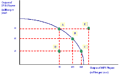
We usually use a slightly more realistic model of PPF. This graph (click on it to see a larger version) shows the trade off between making DVD players and MP3 players. Notice that the graph is not linear and that therefore the slope is not constant. Because the slope of the line represents the trade off between making the two goods, the trade off depends on how many DVD or MP3 players are being produced. For example, moving from point A to point B means we give up 30 DVD players (80-50) and gain 20 (100-80) MP3 players. 30 DVD players represents the opportunity cost of 20 MP3 players. The average opportunity cost for 1 MP3 player is 30/20 = 1.5 DVD players.
Moving from point B to point C, however, we trade 30 DVD players (50-20) for just 10 MP3 players (110-100). On this region of the PPF, 30 DVD players represents the opportunity cost of 10 MP3 players. That means the average opportunity cost for a single MP3 player is 30/10 = 3 DVD players. A PPF curve like this one shows increasing costs. The more MP3 players we want to make, the more each one costs.
The graph above also shows us another nifty use for PPFs. The curve represents the most productive combinations of goods. At any point on the line, it is not possible to produce more of one good without producing less of the other. Inside the line, at point D for example, it is possible to produce both more DVD players and more MP3 players. Because we are obviously not using our resources optimally at point D, we refer to that point as inefficient. Point E, on the other hand, is outside the PPF. It is not possible to produce that combination of DVD and MP3 players.
One note about PPF's and reality. Obviously we have more choices than just the two presented in these PPFs. We could construct a more complex PPF in 3 dimensions to show the trade off between 3 options. Or an abstract n-dimensional PPF to show the trade offs between n different options. But that's way more complicated than we need to get. The simple 2 dimensional model is sufficient to illustrate the idea that the trade offs between two competing alternatives can be quantified by a PPF.

